
Numerical Data#
Numerical data consists of discrete and continuous number values. Discrete data values are countable values, such as the number of marbles in a jar or shoe sizes. Continuous data values can be thought of as values having decimal values, such as height recordings or temperature collections. In this section, we will practice making histograms, scatter plots, and line graphs to represent numerical data.
Let’s load the necessary libraries and read in the data.
import numpy as np
import pandas as pd
import seaborn as sns

from matplotlib import pyplot as plt
plt.style.use('fivethirtyeight')

military = pd.read_csv("../../data/NorthAmerica_Military_USD-PercentGDP_Combined.csv", index_col='Year')

military
| CAN-PercentGDP | MEX-PercentGDP | USA-PercentGDP | CAN-USD | MEX-USD | USA-USD | |
|---|---|---|---|---|---|---|
| Year | ||||||
| 1960 | 4.185257 | 0.673509 | 8.993125 | 1.702443 | 0.084000 | 47.346553 |
| 1961 | 4.128312 | 0.651780 | 9.156031 | 1.677821 | 0.086400 | 49.879771 |
| 1962 | 3.999216 | 0.689655 | 9.331673 | 1.671314 | 0.099200 | 54.650943 |
| 1963 | 3.620650 | 0.718686 | 8.831891 | 1.610092 | 0.112000 | 54.561216 |
| 1964 | 3.402063 | 0.677507 | 8.051281 | 1.657457 | 0.120000 | 53.432327 |
| ... | ... | ... | ... | ... | ... | ... |
| 2016 | 1.164162 | 0.495064 | 3.418942 | 17.782776 | 5.336876 | 639.856443 |
| 2017 | 1.351602 | 0.436510 | 3.313381 | 22.269696 | 5.062077 | 646.752927 |
| 2018 | 1.324681 | 0.477517 | 3.316249 | 22.729328 | 5.839521 | 682.491400 |
| 2019 | 1.278941 | 0.523482 | 3.427080 | 22.204408 | 6.650808 | 734.344100 |
| 2020 | 1.415056 | 0.573652 | 3.741160 | 22.754847 | 6.116377 | 778.232200 |
61 rows × 6 columns
Scatter plots#
Scatter plots can be used to visualize the relationship between two numerical variables. They are most commonly used to visualize two continuous numerical variables against each other (in other words, the data takes on values that are between whole number integers). These plots can also be used when data takes on a large number of different discrete integers. We will use a scatter plot to visualize the percentage of the GDP (Gross Domestic Product) of Mexico spent on the military versus the absolute dollar amount (in USD) over 1960-2020.
We’ll simply extract the columns for this data and assign them to mex_gdp and mex_usd, respectively. Then, we can plot this data using the plt.scatter() function and use plt.show() to display the plot.
mex_gdp = military[['MEX-USD']]

mex_usd = military[['MEX-PercentGDP']]

plt.scatter(mex_gdp, mex_usd)  # mex_gdp on the x-axis, mex_usd on the y-axis

plt.show()

Looking at this scatter plot out of context, it would be hard to understand what the data means. Let’s add some important details to make it clear.
Firstly, we can add a title using the plt.title() function. This function accepts a string argument to be used as the text for the title. It also has an optional pad parameter, which dictates the space between the title and the plotting area.
We can also use plt.ylabel() and plt.xlabel() to label the y- and x-axes, respectively, and plt.figure() to set the figure size. We can pass (6,3) into the figsize to make a 6in x 3in figure.
plt.figure(figsize=(6,3))

plt.scatter(mex_gdp, mex_usd)

plt.title("% GDP vs. Absolute Spending on Military in Mexico 1960 - 2020", pad=30)

plt.ylabel('Spending in USD (Billions)')
plt.xlabel('Percentage of GDP')

plt.show()
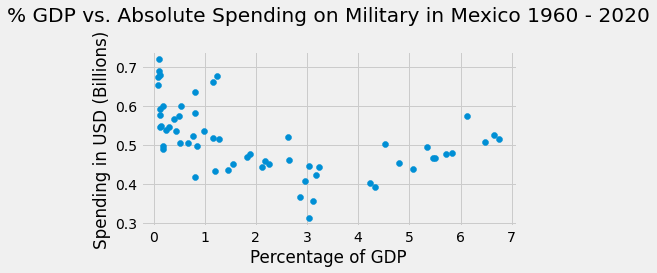
Now we have a better understanding of the data.
In addition to this information, we can add a color scheme that will color each data point based on the year of collection. This adds another dimension of analysis, using year as a feature; the context of the spending relationship can be examined over time.
The plt.scatter() function minimally needs two arguments - x and y - which are array-like variables. Other optional arguments include c, which determines how to color the data points; alpha, which sets the opacity of the data points; and cmap which sets the Colormap used to color the data points.
The plt.colorbar() function displays a scale of the Colormap based on the feature used to color the data, which in our case is the year of collection.
plt.figure(figsize=(6,3))

mex_years = mex_gdp.index

plt.scatter(mex_gdp, mex_usd, c=mex_years, alpha=0.4, cmap='winter')

plt.title("% GDP vs. Absolute Spending on Military in Mexico 1960 - 2020", pad=30)

plt.ylabel('Spending in USD (Billions)')
plt.xlabel('Percentage of GDP')

plt.colorbar()

plt.show()
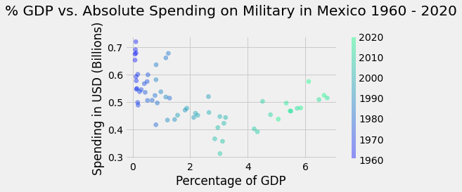
We used the years of the dataset (which we defined as the index earlier in this chapter) as our c argument to color the data points based on the year of collection. We used the winter Colormap as our cmap argument, but many other Colormaps are available for your choosing. A list of other possible Colormaps to explore can be found here.
Line graphs#
Next, we’ll examine the use of a line graph as another visualization tool for numerical data. Line graphs are used to visualize sequential numerical data. By using line graphs, we can easily see trends within data over time.
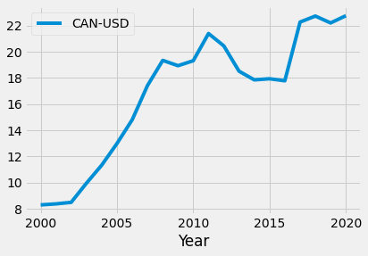
Let’s examine the spending (in USD) on the military in Canada in the 21st century (2000-2020). We can extract this data and call it can_usd.
In Python, visualizations can be made using DataFrame methods or by directly calling functions from the pyplot library in matplotlib. We can quickly create a line graph using plot() method on the can_usd DataFrame:
can_usd = military[['CAN-USD']].loc[2000:2020]

can_usd.head()
| CAN-USD | |
|---|---|
| Year | |
| 2000 | 8.299385 |
| 2001 | 8.375571 |
| 2002 | 8.495399 |
| 2003 | 9.958246 |
| 2004 | 11.336490 |
can_usd.plot()
plt.show()
The same plot can be made using the pyplot function plt.plot():
plt.figure(figsize=(8,3)) # Set figure dimensions
plt.plot(can_usd)
plt.show()
Notice how the plot() method automatically uses the Year column to label the x-axis, while the plt.plot() function does not. This can simply be remedied using the plt.xlabel() function. We can add a y-label as well using plt.ylabel().
Also notice the increments of the x-axis for the second plot is listed as floats. To change these increments to integers, we can create an array consisting of years of the desired increments and then use it as an argument for the plt.xticks() function:
years = np.arange(2000, 2021, 5)

years
array([2000, 2005, 2010, 2015, 2020])
plt.figure(figsize=(8,3))
plt.plot(can_usd)
plt.xlabel('Year')
plt.ylabel('USD (Billions)')
plt.xticks(years)
plt.show()

We can see from the graph that Canada’s spending on the military has increased overall since 2000. The country had a period of time (around 2011 to 2017) where military spending was decreasing consistently.
Visualizing multiple trends using line graphs#
We can view trends for multiple variables at once. Let’s add the data for Mexico as well to see the country’s spending in the 21st century.
plt.figure(figsize=(8,3))

mex_usd = military[['MEX-USD']].loc[2000:2020]

plt.plot(can_usd)
plt.plot(mex_usd)

plt.xlabel('Year')
plt.ylabel('USD (Billions)')
plt.xticks(years)

plt.show()

We can now see that the military spending for both Mexico and Canada is vastly different. However, just looking at this graph out of context, we wouldn’t be able to tell which line corresponds to which country. Let’s add some descriptive details, such as a legend and a title:
plt.figure(figsize=(8,3))

plt.plot(can_usd, label='Canada')
plt.plot(mex_usd, label='Mexico')

plt.xlabel('Year')
plt.ylabel('USD (Billions)')
plt.xticks(years)

plt.legend(loc="best")       # Adds a legend to the figure
plt.title("Military Spending in Mexico and Canada in the 21st Century", pad=10)

plt.show()
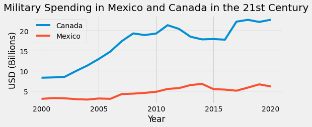
We can see that the overall trend of military spending in Mexico also increased from 2000 to 2020. However, this increase was a lot less drastic than observed in Canada. Mexico’s military spending was a steady rise from about $3 billion to $6 billion over the course of 20 years, while Canada’s spending rose from $8 billion to about $23 billion over the same period of time.
Let’s add data from the United States to see the trends in all North American countries.
plt.figure(figsize=(8,3))

usa_usd = military[['USA-USD']].loc[2000:2020]

plt.plot(can_usd, label='Canada')
plt.plot(mex_usd, label='Mexico')
plt.plot(usa_usd, label='United States')

plt.xlabel('Year')
plt.ylabel('USD (Billions)')
plt.xticks(years)

plt.legend(loc="best")
plt.title("Military Spending in North America in the 21st Century", pad=10)

plt.show()

With the addition of the data from the United States, it’s difficult to discern the data from Canada and Mexico. Because the spending on the military in the United States was a lot higher, plotting all three datasets on the same graph with the same axis does not allow us to clearly see trends in the other countries.
To address this, we can graph the data for each country separately with axis limits that are tailored to each country. If we graph this data side by side, we can see the trends in each country while acknowledging that the axis intervals for each country provides a numerical context for cross-comparisons.
To do this, we use the plt.subplots() function. This function creates a figure object and axis objects, which we will name fig and ax, respectively. More information on the workings of plt.subplots() is linked at the end of this section.
By using plt.subplots(), we can add data for Canada, Mexico and the United States to the same figure by specifying the data assigned to each ax object. Here, we will define three ax objects: ax1, ax2, and ax3. This will allow us to create three separate plotting areas, bounded by three different axes, that are contained within one figure.
Once the figure and axes are defined, we can create a title for the entire figure using fig.suptitle(). Using the .plot() method for each ax object, we can specify which data to plot in each axis. We can also specify other plotting features about each axis by using various methods on each axis object, such as the set_title(), set_xlabel(), set_ylim(), and set_xticks() methods:
# Defines a figure object and three axis objects
# Sets the dimensions of the figure (1 x 3 axes)
# Sets the figure size (15in x 3in)
(fig, (ax1, ax2, ax3)) = plt.subplots(1, 3, figsize=(15, 3))


# Sets title for entire figure
fig.suptitle('Military Spending in North America in the 21st Century', y=1.1, fontsize=15)


# Makes plots for each axis
ax1.plot(can_usd, color='blue')              # Plots Canada data to ax1
ax1.set_title('Canada')                      # Sets title for ax1
ax1.set_ylim([8, 24])                        # Sets y-axis limits for ax1
ax1.set_xlabel('Years')                      # Sets x-axis labels for ax1
ax1.set_ylabel('USD (Billions)')             # Sets y-axis labels for ax1
ax1.set_xticks(years)                        # Sets x-ticks for ax1

ax2.plot(mex_usd, color='red')               # Plots Mexico data to ax2
ax2.set_title('Mexico')                      # Sets title for ax2
ax2.set_ylim([2.5, 7])                       # Sets y-axis limits for ax2
ax2.set_xlabel('Years')                      # Sets x-axis labels for ax2
ax2.set_ylabel('USD (Billions)')             # Sets y-axis labels for ax2
ax2.set_xticks(years)                        # Sets x-ticks for ax2

ax3.plot(usa_usd, color='orange')            # Plots U.S. data to ax3
ax3.set_title('United States')               # Sets title for ax3
ax3.set_ylim([300, 800])                     # Sets y-axis limits for ax3
ax3.set_xlabel('Years')                      # Sets x-axis labels for ax3
ax3.set_ylabel('USD (Billions)')             # Sets y-axis labels for ax3
ax3.set_xticks(years)                        # Sets x-ticks for ax3

plt.show()

Now that we’ve created separate subplots, we can see the trends for all three countries over the last 20 years. All three countries seem to have decreased spending around 2011 and 2018. By observing the difference in scale, we can also see that while the trends are similar, the magnitude of spending was very different between Canada, Mexico, and the United States.
Histograms#
Histograms are a great way to view a distribution of numerical data. A distribution of a dataset is a visual display of all the values within the dataset when plotted on a graph, showing the frequency of occurence of said values.
In histogram plots, a numerical component of data is divided into what are called bins. As data points are assigned to their respective bins, the total number of data points in each bin is quantified and plotted, visualizing a distribution of frequencies. In the upcoming exercise, we will explore how to visualize distributions of values in our dataset.
Let’s examine military spending in the United States from 1960 to 2020. We can look at multiple ranges of dollar amounts spent on the military as our independent variable and organize them into bins. After, we can determine how many fiscal years fall into each of these bins and visualize the distribution.
First, we will need to extract the data pertaining to the military spending in the United States. We will call it hist_data. Then, we will need to determine the minimum and maximum values of this subset of data so that we can determine the range of values.
hist_data = military["USA-USD"]

print('min:', hist_data.min())
print('max:', hist_data.max())
min: 47.34655267
max: 778.2322
We see that the minimum amount the United States spent on the military between the years of 1960 and 2020 was about $47 billion, while the maximum amount was about $780 billion.
With this information, we will create a range for our bins, named binnum, with integers between 0 and 801, so that it is inclusive of all the data values. We make the interval of the range 100, giving us eight evenly spaced bins.
binnum = np.arange(0, 801, 100)

list(binnum)
[0, 100, 200, 300, 400, 500, 600, 700, 800]
To graph the distribution of military spending, a histogram can be made by using the hist() DataFrame method. We can specify the bins so that they are evenly distributed on the x-axis. We can do this by inputting binnum as our bins argument. If we do not specify the bin argument, the data will be divided into 10 bins by default.
hist_data.hist(bins=binnum)
plt.show()

We can also use the plt.hist() function to make the same graph:
plt.hist(hist_data, bins=binnum)

plt.show()
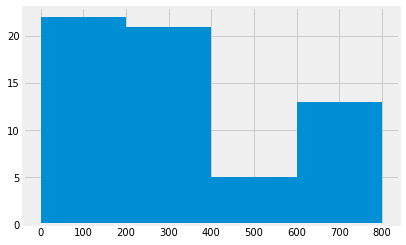
When determining the bins for a histogram, the bin size controls the number of bins that will show. A smaller bin size will result in more bins, which will show more granularity of the data, but could make it difficult to see patterns in the data. A larger bin size decreases the visible detail of the data, but could also make it hard to discern useful take aways from the data. While exploring data, it’s important to try different bins sizes out to see which display provides the most useful information for your analysis needs.
Consider the different bin sizes below:
plt.hist(hist_data, bins=range(0, 801, 200))

plt.show()
plt.hist(hist_data, bins=range(0, 801, 50))

plt.show()
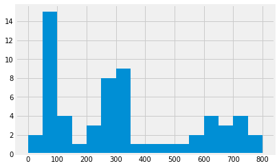
Both histograms show the same data in different ways. The top histogram has a larger bin size and from it, we can see that it shows most of the values in the data fall within the range of 0-200. The second one has a smaller bin size, and we can see that most of the values of the data fall within the range of 50-100. The latter gives us a more specific range of where most of the data lie, which can be useful down the line.
For now, let’s stick with the bin size in the latter graph. Now that we have our plot, let’s add additional details to make it more informative:
plt.hist(hist_data, bins=range(0, 801, 50))
plt.title("Distribution of Military Spending in the United States from 1960 to 2020")
plt.ylabel('Counts of Fiscal Years')
plt.xlabel("Dollar Amount (USD)")
plt.show()
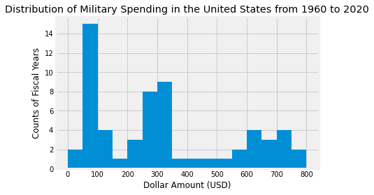
Awesome! From this plot, we can see that the United States had the highest frequency of fiscal years where $50 - $100 billion was spent on the military, while the $400 - $550 billion and $150 - $200 bins had the lowest frequencies with only 1 year spending those ranges of money.
Visualizing multiple distributions using histograms#
We can also view multiple distributions on one plot on using multiple plots. Let’s look at the distributions of the percentage of GDP spent on the military in Canada and the United States from 1960 to 2020.
perc_gdp = military[['CAN-PercentGDP', 'USA-PercentGDP']]
perc_gdp
| CAN-PercentGDP | USA-PercentGDP | |
|---|---|---|
| Year | ||
| 1960 | 4.185257 | 8.993125 |
| 1961 | 4.128312 | 9.156031 |
| 1962 | 3.999216 | 9.331673 |
| 1963 | 3.620650 | 8.831891 |
| 1964 | 3.402063 | 8.051281 |
| ... | ... | ... |
| 2016 | 1.164162 | 3.418942 |
| 2017 | 1.351602 | 3.313381 |
| 2018 | 1.324681 | 3.316249 |
| 2019 | 1.278941 | 3.427080 |
| 2020 | 1.415056 | 3.741160 |
61 rows × 2 columns
print(perc_gdp.min())
print(perc_gdp.max())
CAN-PercentGDP    0.989925
USA-PercentGDP    3.085677
dtype: float64
CAN-PercentGDP    4.185257
USA-PercentGDP    9.417796
dtype: float64
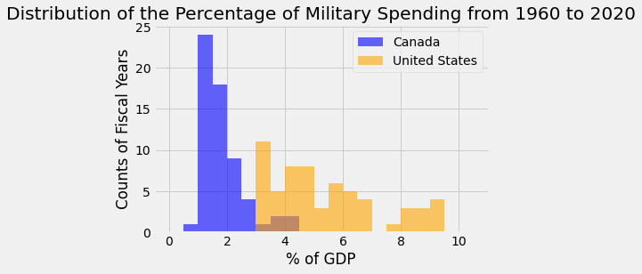
We see that the minimum values between these two countries is about 0.98%, while the maximum value is about 9.4%. To plot both of these distributions on a single plot, we can create another array called binnum2 that can include all of the values.
We can then make histograms for each country, specifying the labeling and colors for each. We’ll also add a legend to show which color corresponds to which country, as well as proper titles and labeling:
binnum2 = np.arange(0,11, step = 0.5)

# plotting histograms

plt.hist(perc_gdp['CAN-PercentGDP'], label='Canada', alpha=0.6, color = 'blue', bins=binnum2)
plt.hist(perc_gdp['USA-PercentGDP'], label='United States', alpha=0.6, color = 'orange', bins=binnum2)

# labeling
plt.legend(bbox_to_anchor=(1, 1))
plt.title('Distribution of the Percentage of Military Spending from 1960 to 2020')
plt.xlabel('% of GDP')
plt.ylabel('Counts of Fiscal Years')
plt.show()
Additionally, we can use the plt.subplots() function to create two separate plots in one figure. By specifying ax1 and ax2, we can use the hist() method to create a histogram and set titles and axis labels for each axis.
(fig, (ax1, ax2)) = plt.subplots(1, 2, figsize=(12, 3))

plt.suptitle('Distribution of the Percentage of Military Spending from 1960 to 2020', y=1.1)

ax1.hist(perc_gdp['CAN-PercentGDP'], color = 'blue')
ax1.set_title('Canada')
ax1.set_xlabel('Dollar Amount (USD)')
ax1.set_ylabel('Counts of Fiscal Years')

ax2.hist(perc_gdp['USA-PercentGDP'], color = 'orange')
ax2.set_title('United States')
ax2.set_xlabel('Dollar Amount (USD)')
ax2.set_ylabel('Counts of Fiscal Years')


plt.show()
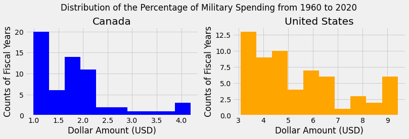
Notice with the above use of the hist() method, we did not specify the bins for each axis. Thus, each subplot created 10 bins by default to fit the range of the data.
Conclusions#
In this section, we learned functions and methods to create histograms, scatter plots, and line graphs as a means of visualizing numerical data.
The plt.scatter() and plt.plot() functions require numerical arrays that serve as x and y arguments. The plt.hist() function requires one numerical array of values for plotting distributions of data.
The hist() and plot() methods can also be used directly on DataFrames to create histograms and line plots, respectively.
We can also create subplots within a figure using plt.subplots().
Lastly, we learned about a number of other functions that can be used to enhance and annotate our plots. Documentation for the functions used in this section, and related functions, are listed below: